The Bieler Press was commissioned to produce one of the final chapbooks of The Gruffyground Press. This was followed by several other projects from Gruffyground. Descriptions of several titles follows:
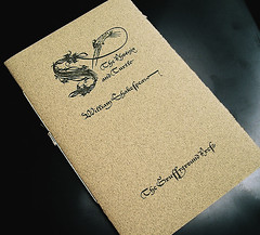
The Phoenix and Turtle. The poem of ‘Truthes and Beauties doome and date’ by William Shakespeare. Based on a setting by Sem Hartz. Hartz, in an attempt to capture the look of the Secretary hand of Shakespeare’s period, chose the Enschedé foundry’s Lettres Françoise Civilité of Robert Granjon for his edition. The typeface used in this edition is a size-optimized and letterpress-configured version of Hoefler & Frere-Jones' digital rendition.
The cover features a digitally reconstructed engraved ornamental initial originally designed by Richard Pynson (ca 1505). A capital S, with the head and elongated neck of a mythological bird extending out from the letterform.
Designed and letterpress printed by Gerald Lange from photopolymer plates on Frankfurt Creme and Curtis Flannel (covers). Hand sewn by the publisher, Anthony Baker.
The edition is limited to 220 copies. 11 pages. 4-1/8 by 6-1/4 inches. 2003. Available for purchase from the publisher.
Current is An Elegie by Ben Jonson, whose production is patterned after the above The Phoenix and Turtle, but features another Civilité (based on the original Saint Augustin) from the digital foundry P22. Papers (except for cover color) and sizing are otherwise similar. This is typeset by Baker's bibliographer Mark Askam of Chestnut Press, who also created a similar cover image to fit this new publication (a composite from 15th century elements of Vérald and Malliet). This is considered the second issue in Gruffygrounds' Shakespeare and His Contemporaries series.
Designed and letterpress printed by Gerald Lange from photopolymer plates on Frankfurt Creme and Curtis Flannel (covers). Hand sewn by the publisher. The edition is limited to 220 copies. 7 pages. 4-1/8 by 6-1/4 inches. 2014.

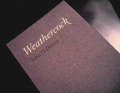
Weathercock. A poem by John Holloway. The typeface used in this edition is a size-optimized and letterpress-configured version of Monotype Imaging’s Granjon. To capture the flavor of the poem, the titling on the cover was hand bronzed with pale golds, natural copper, and silver metallic powders.
Designed and letterpress printed by Gerald Lange from photopolymer plates on dampened Curtis Ragston and Curtis Flannel (covers). Hand sewn by the publisher, Anthony Baker.
The edition is limited to 45 copies. 5 pages. 4-3/4 by 7-7/32 inches. 2006. NFS.