—Charlene Garry, Basilisk Press & Bookshop Catalogue
Press Review
It is hard to explain in words why a private press is uncommonly good—though that opinion can usually be formed immediately if the books are seen. There is, therefore, no way to say convincingly that the [chapbooks of Gerald Lange’s Bieler Press], intelligently designed, immaculately printed and containing charming illustrations, are head and shoulders above their contemporaries—but it’s true.
The Gruffyground Press chapbooks
The Bieler Press was commissioned to produce one of the final chapbooks of The Gruffyground Press. This was followed by several other projects from Gruffyground. Descriptions of several titles follows:
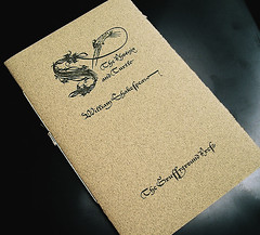
The Phoenix and Turtle. The poem of ‘Truthes and Beauties doome and date’ by William Shakespeare. Based on a setting by Sem Hartz. Hartz, in an attempt to capture the look of the Secretary hand of Shakespeare’s period, chose the Enschedé foundry’s Lettres Françoise Civilité of Robert Granjon for his edition. The typeface used in this edition is a size-optimized and letterpress-configured version of Hoefler & Frere-Jones' digital rendition.
The cover features a digitally reconstructed engraved ornamental initial originally designed by Richard Pynson (ca 1505). A capital S, with the head and elongated neck of a mythological bird extending out from the letterform.
Designed and letterpress printed by Gerald Lange from photopolymer plates on Frankfurt Creme and Curtis Flannel (covers). Hand sewn by the publisher, Anthony Baker.
The edition is limited to 220 copies. 11 pages. 4-1/8 by 6-1/4 inches. 2003. Available for purchase from the publisher.
Current is An Elegie by Ben Jonson, whose production is patterned after the above The Phoenix and Turtle, but features another Civilité (based on the original Saint Augustin) from the digital foundry P22. Papers (except for cover color) and sizing are otherwise similar. This is typeset by Baker's bibliographer Mark Askam of Chestnut Press, who also created a similar cover image to fit this new publication (a composite from 15th century elements of Vérald and Malliet). This is considered the second issue in Gruffygrounds' Shakespeare and His Contemporaries series.
Designed and letterpress printed by Gerald Lange from photopolymer plates on Frankfurt Creme and Curtis Flannel (covers). Hand sewn by the publisher. The edition is limited to 220 copies. 7 pages. 4-1/8 by 6-1/4 inches. 2014.
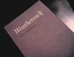
Weathercock. A poem by John Holloway. The typeface used in this edition is a size-optimized and letterpress-configured version of Monotype Imaging’s Granjon. To capture the flavor of the poem, the titling on the cover was hand bronzed with pale golds, natural copper, and silver metallic powders.
Designed and letterpress printed by Gerald Lange from photopolymer plates on dampened Curtis Ragston and Curtis Flannel (covers). Hand sewn by the publisher, Anthony Baker.
The edition is limited to 45 copies. 5 pages. 4-3/4 by 7-7/32 inches. 2006. NFS.
The RAS Press productions:
[click on image to view it in its entirety—you will be taken to the flickr site]
The Bieler Press is providing consultation and production work for the forthcoming The Nefertiti-Tut Express: A Story in Screenplay, a ‟lost″ screenplay authored by Ray Bradbury. Illustrated by Gary Gianni. Letterpress printed by Terence McVicker. NYP—expected release, 2014 (a trade edition is currently available).
‟The NEFERTITI-TUT EXPRESS is a beautiful and fantastic book!″—Ray Bradbury
This is Bradbury's last published book before his death. Contact The RAS Press for further information and pricing.
Also available:
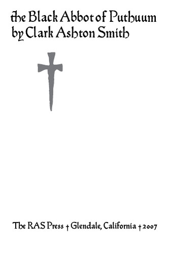
This chapbook presents, for the first time, Smith′s story from the unaltered original manuscript (1935). Included is a reproduction of the long thought lost illustration of Virgil Finlay (from the story′s first published version in the famed magazine Weird Tales)—here, for the first time in its original coloration. Typographic design and printing by Gerald Lange of The Bieler Press. The titling face shown here is a digitally revived version (in situ from letterpress printed pages) of the typeface the renowned calligrapher Edward Johnston designed for the acclaimed Cranach Press Hamlet [1929]; which was based on the fifteenth-century transitional gothic types of Sweynheym and Pannartz. The chapbook′s text face is Monotype Bell. Both typefaces were size-optimized for printing. The Curtis Flannel covers were letterpress printed, the text was digitally printed on Mohawk 50/10 archival quality paper. The chapbook was sewn by the publisher, Terence McVicker, in an edition limited to 250 numbered copies. The tipped-in illustration was ink jet printed by McVicker.
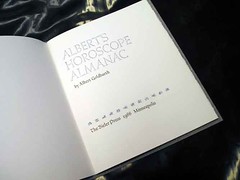
Albert’s Horoscope Almanac / Albert Goldbarth
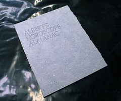
Albert’s Horoscope Almanac is a collection of twelve horoscopic poems by Albert Goldbarth.‟Good for Any Year.”
This chapbook was handset in Goudy Thirty and an altered version of Weiss Series I Initials. Letterpress printed in two colors (titles and folios [zodiac ornaments] in sky blue) on T. H. Saunders Blue Laid mouldmade paper. Sewn into covers of handmade Larroque Blue paper. Issued in an edition of 200 numbered copies signed by the author.
The stars are not favorable. The stars are not
unfavorable. The stars couldn’t influence
midges at a porchlight.

Minneapolis, 1986. $59.95.
A Printer's Dozen / Philip Gallo / Gaylord Schanilec
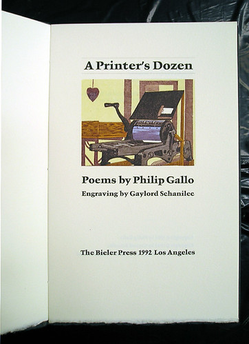
A Printer’s Dozen. Twelve poems on printing, bookcraft, life, and love by Philip Gallo. Featuring a five-color title-page engraving by Gaylord Schanilec (his first photographic multiple-color engraved work).
These poems are funny and serious and charming. . . . A Printer’s Dozen reflects all the wonderful qualities we have come to expect from Bieler Press. —Bookways
Designed by Gerald Lange. Printed by Lange and Robin Price. Handset in Garamond Bold and Trump Medieval Bold (display) and printed in two colors on mouldmade Invicta paper. Bound into covers of Larroque Black handmade paper. Issued in an edition of 200 numbered copies signed by the author and illustrator.
Recipient of a Type Directors Club Exhibition Citation for Typographic Excellence (Judge’s Choice selection). An article on the making of the book appeared in the book arts journal, AbraCadaBrA, in the spring of 1994. $275.
René Magritte tribute
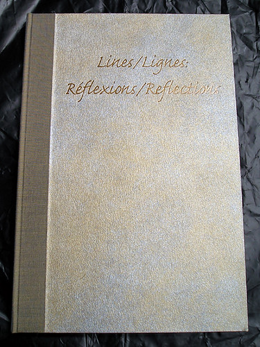
A rarely found Bieler Press production, Lines/Lignes : Refléxions/Reflections, was commissioned by the Armand Hammer Museum of Art and Cultural Center, Los Angeles, in 1996 to coincide with the opening of the Center’s Magritte exhibition.
The book is a portfolio consisting of two volumes: Lines/Lignes, which contains the work of six contemporary poets’ responses to several of René Magritte’s paintings and sculpture, and Refléxions/Reflections, which contains six high-quality color reproductions of the renowned artist’s work alluded to by the poets: Jorie Graham, Debora Greger, John Hollander, Richard Howard, J. D. McClatchy, and Rosanna Warren. Edited by Stephen Yenser, with Introduction.
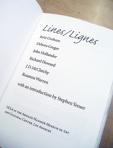 Typography and printing by Gerald Lange of The Bieler Press, Marina del Rey. The text was digitally set in letterpress configured versions of Adobe Minion and Adobe’s Caflish Script and letterpress printed from photopolymer plates on Frankfurt White, an acid-free mouldmade paper.
The portfolio and companion volume were designed by Lilli Colton and make use of a number of vividly colored papers and was bound and assembled at The Campbell-Logan Bindery.
The portfolio measures 6-3/8 by 9-1/2 inches. The chapbook Lines/Lignes consists of 26 pages. Issued in an edition of 200 numbered copies. Available direct from the Bieler Press. $395.
Subscribe to:
Posts (Atom)